How to Build a High-Trust “Gaming / Casino” Landing Page (Compliance + UX + Trust Signals)
A high-trust gaming/casino landing page has one job: reduce uncertainty. Visitors arrive with questions about legitimacy, payouts, rules, and safety—so your page must answer those questions faster than it tries to sell. If you’re building or optimizing a casino-style landing page, it also helps to review how casino offers, bonuses, and game categories are commonly presented; a quick scan of a guide-style site like https://gerikazino.com/ can give you a sense of the “standard expectations” users bring with them (18+ only, and treat gambling strictly as entertainment, not income). Once you know what users expect, you can design a page that is clear, compliant, and conversion-friendly without feeling pushy.
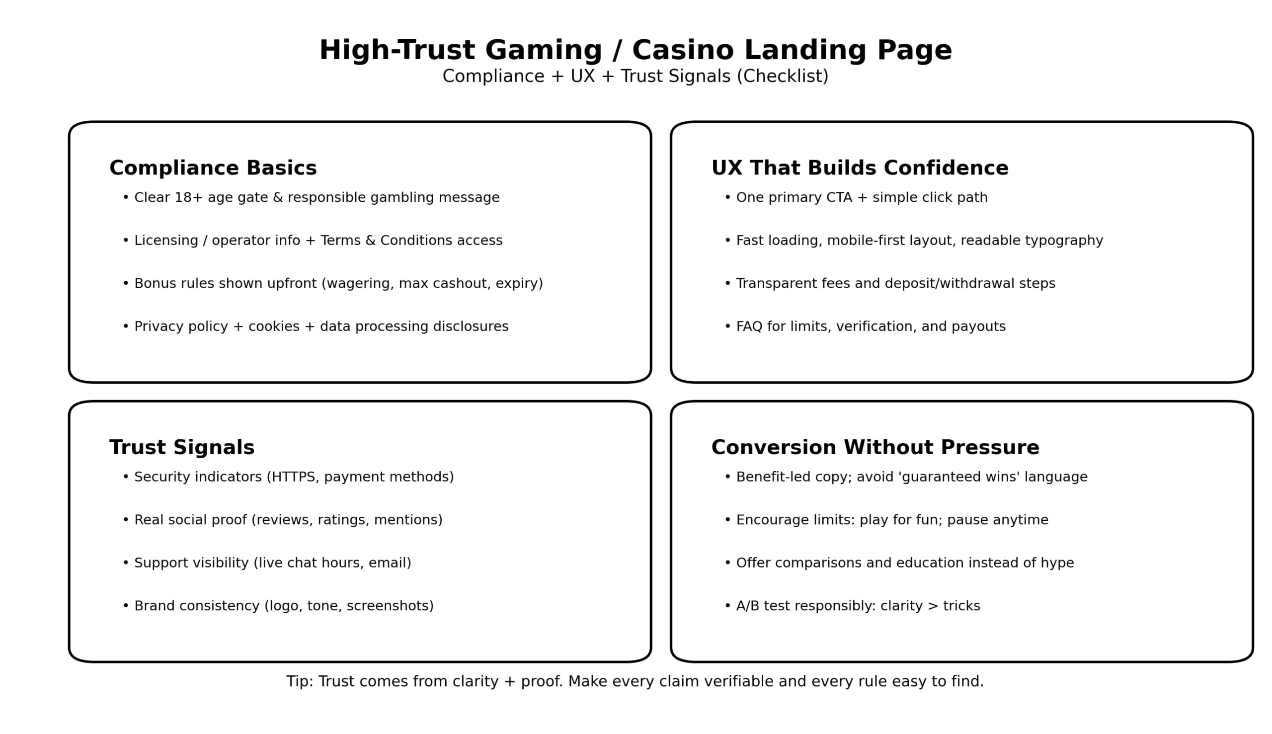
Below is a practical blueprint you can apply to any gaming/casino landing page—whether it’s for an operator, an affiliate review page, or a promotional campaign.
1) Start with compliance: it’s your first trust signal
In regulated niches, compliance isn’t just a legal requirement—it’s part of UX. Users trust what they can verify.
Must-have compliance elements (place them where users will actually see them):
- 18+ / age restriction clearly visible in the header or near the main CTA
- Responsible gambling message and links to help resources (in footer + at least one visible mention above the fold)
- Terms & Conditions link that is easy to find (not hidden behind tiny text)
- Operator / brand identification (who runs the service, licensing references if applicable)
- Privacy policy + cookie notice (especially if you track or retarget)
Critical rule: never use copy that implies guaranteed profit or “easy money.” It damages trust and can violate advertising rules in many jurisdictions.
2) Define one primary action and make it feel safe
Casino landing pages often fail because they chase too many actions: “Join,” “Claim bonus,” “Download,” “Chat,” “Subscribe,” “Compare,” “Read reviews.” When everything is important, nothing is.
Choose one primary CTA and one secondary CTA:
- Primary: “Claim Offer”, “Play Now”, or “Compare Casinos” (depending on your page type)
- Secondary: “See Bonus Terms”, “Read Reviews”, or “How It Works”
Make the CTA feel safe by pairing it with clarity:
- “No credit card needed” (if true)
- “T&Cs apply” with a direct link
- “18+” badge
- Clear steps (what happens after the click)
3) Put the hard questions above the fold
High-trust pages “front-load” the answers users care about. Above the fold (first screen), include:
- What the offer is (in plain language)
- Who it’s for (country/eligibility if relevant)
- The key restriction (wagering requirement or verification requirement)
- Why it’s safe (license info, secure payments, support availability)
- One clear CTA
A simple above-the-fold structure that works:
- Headline = outcome + category
- Subheadline = what’s included + key condition
- Trust row = payments + security + 18+ + support
- CTA + “T&Cs apply”
- Link: “See full bonus rules”
4) Make bonus and promo rules painfully clear
Nothing destroys trust faster than “hidden terms.” If you promote a bonus, state the basics upfront:
- Wagering requirement (e.g., “x35”)
- Minimum deposit
- Max cashout
- Game contribution rules (slots vs table games)
- Expiry date / time window
You don’t need to show every legal line above the fold—but you must show the main constraints early, then link to full T&Cs.
UX tip: use a “Bonus Summary” box with 5–7 bullet points. People scan. Don’t bury it in paragraphs.
5) Use trust signals that are verifiable (not decorative)
Many sites add badges that look official but mean nothing. Users are getting smarter. Real trust signals are specific and checkable.
High-trust signals to include:
- Security basics: HTTPS, encryption mention, secure payments
- Payment method logos: Visa/Mastercard/e-wallets/crypto (only if actually supported)
- Real support presence: live chat hours, email, response time promise (if true)
- Third-party proof: review platform ratings, reputable mentions, audited RNG/provider notes (where applicable)
- Responsible gambling tools: deposit limits, timeouts, self-exclusion, reality checks
Avoid fake urgency (“Only 2 spots left”) or manipulative countdown timers unless they reflect a real deadline.
6) Design for confidence: readability, spacing, and calm visuals
A casino landing page doesn’t have to look boring—but it must feel controlled and readable.
UI choices that increase trust:
- Large font sizes (16px+ body text)
- High contrast (especially on mobile)
- Consistent spacing and alignment
- Short sections with clear headings
- A predictable navigation pattern (sticky “Bonus rules” or “FAQ” anchor links)
If you use flashy visuals, balance them with clean structure. “Excitement” can exist in imagery; “clarity” must exist in layout.
7) Explain the flow: deposits, verification, withdrawals
Users worry about payouts. If you want trust, you must explain the process clearly.
Add a simple “How it works” section:
- Create account (18+, eligible region)
- Verify identity (KYC) when required
- Deposit using supported methods
- Claim bonus (if applicable)
- Withdrawals: typical steps + estimated time ranges (if you can state them accurately)
If you can’t be specific, don’t invent numbers. Say what you can verify.
8) Build a FAQ that removes fear (not just objections)
A strong FAQ answers questions users are slightly uncomfortable asking:
- “Is this legal in my country?”
- “Do I need verification to withdraw?”
- “What are the bonus wagering rules?”
- “Can I set deposit limits?”
- “How do responsible gambling tools work?”
- “What if I have a dispute?”
Keep answers short and link to deeper pages where needed.
9) Conversion without pressure: the safest persuasion strategy
In gambling verticals, pressure kills trust. The best pages convert by being helpful:
- Use benefit-led, neutral copy (“Compare,” “Choose,” “See rules”)
- Remove hype language (“guaranteed,” “sure win,” “easy profit”)
- Encourage safe behavior (“Set a limit first”)
- Make rules visible before asking for action
This approach also reduces chargebacks and support issues—because users feel informed.
10) Measure trust like a performance metric
Trust shows up in behavioral data:
- Scroll depth increases when content feels safe
- Time on page increases when answers are easy to find
- Conversion rates improve when bonus rules are clear
- Refund/dispute rates drop when expectations are set early
Practical tests:
- A/B test headline clarity (not emotional hype)
- A/B test the “Bonus Summary” placement
- Test shorter vs longer forms (often shorter wins)
- Monitor mobile performance (speed + readability)


