How to Make a Website Unique Using a Ready-Made Template?
In the current era of web design, speed is often prioritized over custom coding from scratch. Ready-made templates have become the standard starting point for everyone from local businesses to international brands. However, the biggest risk of using a popular template is the “cookie-cutter” effect—where your website looks identical to a thousand others in your industry. To stand out, you must treat a template not as a finished product, but as a skeletal structure upon which you build your unique brand identity.
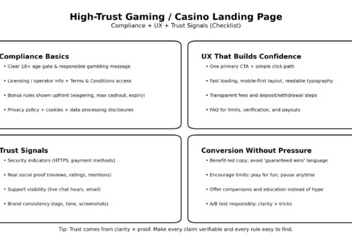
Whether you are designing a portfolio for a freelance artist or a high-traffic hub for live casinos where trust and visual distinction are paramount for player retention, customization is key. A template provides the functional layout, but the “soul” of the website comes from your creative choices. By strategically modifying specific elements, you can create a digital experience that feels bespoke without the five-figure price tag of a custom-developed site.
Mastering the Art of Visual Hierarchy
The first thing a user notices is not the code, but the visual flow of information. Most templates come with a standard hero section and a three-column layout. To make yours unique, you must break these patterns. Visual hierarchy is about guiding the user’s eye to what matters most.
Instead of keeping the default stock images, invest in custom photography or high-quality 3D renders. Even the most generic template can be transformed by unique imagery that tells a specific story. Furthermore, consider the white space. Many users feel the need to fill every inch of the screen, but purposeful “negative space” is often what distinguishes a premium site from a budget one. By increasing the margins around your text and buttons, you give your content room to breathe, making the site feel more sophisticated and less like a pre-packaged theme.
Typography: The Silent Brand Ambassador
Typography is perhaps the most underrated tool in a designer’s arsenal. Most ready-made templates rely on safe, overused fonts like Roboto, Open Sans, or Montserrat. While these are legible, they lack character. Changing the typography is one of the fastest ways to alter the entire mood of a website.
- Pairing Contrasting Fonts: Use a bold, high-personality serif font for your headings and a clean, minimalist sans-serif for your body text. This creates a professional, editorial feel.
- Custom Sizing and Kerning: Don’t stick to the template’s default font sizes. Adjusting the letter spacing (kerning) or line height can drastically improve readability and give the text a custom-tailored appearance.
- Variable Fonts: In 2026, variable fonts allow you to adjust weight and width dynamically, providing a fluid look that traditional templates rarely utilize out of the box.
Color Theory and Micro-Interactions
Colors trigger emotional responses. If you use the default color palette provided by the template, you are adopting the emotional tone chosen by the theme developer, not necessarily the tone of your brand. Instead of using a standard “Blue and White” or “Dark Mode” preset, create a custom palette based on your brand’s unique values. Use a primary brand color for “calls to action” and muted, complementary tones for backgrounds to create depth.
Micro-interactions are another way to inject personality. These are the small animations that happen when a user hovers over a button, scrolls down a page, or clicks a menu. Most templates have very basic transitions. By adding custom CSS animations—such as a slight “lift” on a card or a smooth color fade—you make the website feel “alive” and responsive. These small details signal to the user that the site has been meticulously crafted, rather than just installed.
Strategic Layout Modifications
While you should respect the underlying grid system of a template (to ensure mobile responsiveness), you don’t have to follow its content order. Rearranging sections can break the “template feel.” For example, if the template suggests an “About Us” section followed by “Services,” try swapping them or integrating them into a single, cohesive narrative.
Adding custom sections that the template didn’t include is also highly effective. This might be a unique “Timeline” of your company’s history, a custom-designed testimonial slider, or an interactive map. Most modern website builders and CMS platforms allow you to inject custom HTML or use a “blank section” tool to build these unique elements within the framework of the template.

The Power of Custom Copywriting
A website is more than just a visual container; it is a communication tool. You can have the most beautiful custom design in the world, but if your text is generic and filled with industry jargon, it will feel like a template. Unique copywriting is the ultimate differentiator.
Avoid “filler” text and generic headlines like “Welcome to our website” or “Best services in the industry.” Use a distinct brand voice—whether it’s witty, authoritative, or deeply personal. When your words are tailored specifically to your target audience, the user stops looking at the layout and starts engaging with the message. This emotional connection is what truly makes a website unique.
Performance as a Design Feature
Finally, a unique website must be a fast website. Templates are often “bloated” with features you don’t actually need. To make your site feel premium, you must strip away the unnecessary scripts and plugins that slow it down. A lightning-fast load time is a feature in itself, providing a smooth user experience that many generic, unoptimized sites lack.
In 2026, uniqueness isn’t about being “weird” or “different” just for the sake of it. It’s about the alignment of your brand goals with the user’s needs. By taking a high-quality template and infusing it with custom typography, strategic colors, and authentic content, you create a digital home that is both functional and unmistakably yours.


