Guide to Changing Menu Color in WordPress Easily
The appearance of your website’s menu plays a vital role in user navigation and overall website design. Changing the menu color in WordPress can align your site with your brand’s color scheme and improve visual appeal. This guide will walk you through the different methods of changing the menu color in your WordPress site.
Using the WordPress Customizer
Accessing and customizing the appearance of a WordPress site involves several steps, starting from the dashboard. The WordPress Customizer, accessed through the ‘Appearance’ > ‘Customize’ option, is a central feature for this purpose. Within the Customizer, users can navigate to specific sections like ‘Menus’ or ‘Header’, though the exact location of these settings can vary depending on the theme in use.
One of the key aspects of customization is altering the menu’s appearance. If the theme supports it, options to change the menu color are available, typically under settings like ‘Background Color’. Alongside this, users can also adjust the text color of the menu, enhancing readability and ensuring design consistency. Themes may also offer customization options for the menu’s font style and size, allowing for a more personalized look.
The functionality of the menu can also be modified. Users can add, remove, or completely overhaul menu items. This includes the ability to create new menus and assign them to various locations on the site, depending on the layout preference. Some themes even allow the addition of widgets to menus, incorporating elements like search bars or social media icons.
An essential aspect of modern web design is ensuring that menus are responsive and function well across various devices. Most themes provide settings for adapting the menu for mobile use, a crucial factor for a mobile-friendly website. As changes are made, the Customizer allows for live previews, enabling users to see how their adjustments will appear in real-time. Once the desired look is achieved, changes can be published to make them live on the site. Conversely, if the changes are not satisfactory, there’s usually an option to revert to previous settings or reset them entirely. For more advanced customization, some themes offer the option to add custom CSS, giving users greater control over the site’s appearance.
Using a Theme-Specific Options Panel
- Finding Theme Options: Some themes offer a separate options panel for customization. This can usually be found under ‘Appearance’ or directly in the dashboard menu;
- Locating Color Settings: Inside the theme options, look for menu settings or color options. Here you can change the menu color according to your preference;
- Understanding Theme Documentation: Many themes come with documentation that explains how to access and use various features. This can be invaluable for understanding the full range of customization options available;
- Exploring Widgets and Sidebars: Besides menus, widgets and sidebars are other elements you can customize. These can often be found in the Customizer or the theme options panel;
- Customizing Headers and Footers: Most themes allow you to customize headers and footers. This includes changes in layout, color, and sometimes even adding widgets or custom HTML;
- Adjusting Layout Settings: Look for layout options in your theme settings. These can include settings for the overall container size, sidebar positioning, and more;
- Integrating Social Media: Many themes allow easy integration of social media links. These settings can usually be found in the header, footer, or widget settings;
- Setting Up a Static Front Page: If you prefer a static page as your homepage instead of the latest posts, this can typically be configured in the Customizer or theme options;
- Customizing Blog Settings: For those running a blog, themes often provide options to customize the blog layout, post metadata display, and more;
- Utilizing Theme Demos: Some themes offer demo content and layouts. These can be a great starting point for setting up your site and understanding what’s possible with the theme;
- Working with Custom Post Types: If your theme supports custom post types, you can find these options in the theme settings, allowing for more diverse content types on your site;
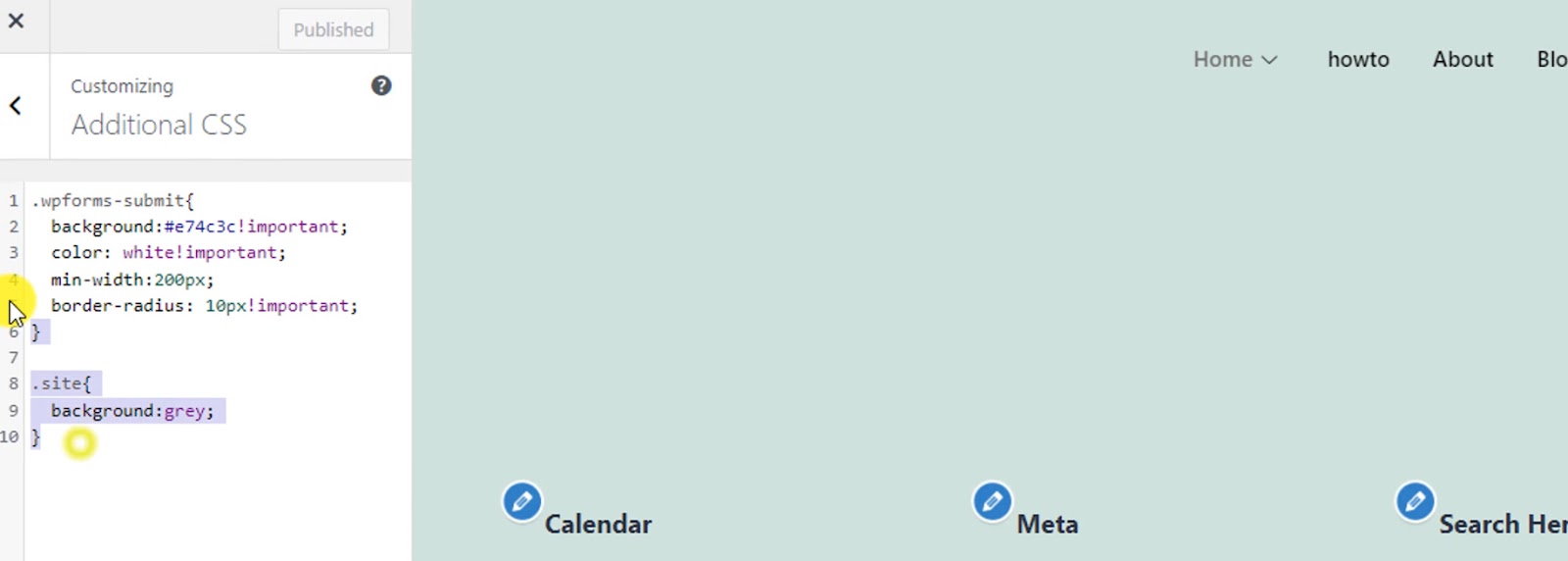
- Exploring Additional CSS: For specific styling needs, the Customizer typically includes an ‘Additional CSS’ section where you can write your own CSS code;
- Utilizing Theme Support: If you encounter difficulties or have questions, most theme developers offer support through forums, email, or documentation;
- Keeping Themes Updated: Regularly updating your theme is crucial for security and functionality. Updates often include new features and compatibility fixes;
- Understanding Plugin Compatibility: Ensure that the plugins you use are compatible with your theme. This is crucial for website functionality and design consistency;
- Experimenting with Child Themes: For advanced customization, consider using a child theme. This allows you to make significant changes without affecting the parent theme;
- Checking Responsiveness: Always check how your customizations look on different devices. Responsiveness is key to a user-friendly website experience;
- Backup Before Major Changes: Before making major changes, it’s always wise to back up your site. This ensures that you can restore the previous state if something goes wrong;
- Engaging with the WordPress Community: For additional tips and tricks, consider engaging with the WordPress community through forums, social media groups, and meetups. This can provide valuable insights and assistance.
Custom CSS Method
Accessing Custom CSS in WordPress offers another layer of customization, especially useful when theme options are limited. To begin, navigate to ‘Appearance’ > ‘Customize’ and then to the ‘Additional CSS’ section. Here, users can directly input CSS code to alter various aspects of their site’s appearance, including the menu.
The critical step in customizing through CSS is identifying the correct CSS selector for the menu. This requires a bit of technical know-how but is made easier with the browser’s inspect tool. By right-clicking on the menu and selecting ‘Inspect’ in most browsers, you can view the HTML and CSS associated with the menu. Look for an identifier, which is often an ID or class, associated with the menu element. This identifier, or selector, is what you’ll use to target the menu in your CSS.
For example, if the inspect tool reveals that your menu has an ID of ‘main-menu’, you can use this ID to write your custom CSS. To change the background color of the menu, the CSS code would look something like:
```css
#main-menu { background-color: #000000; }
```
In this snippet, `#main-menu` is the selector targeting the menu, and `background-color` is the CSS property being changed. The value `#000000` represents the color, in this case, black, but you can replace this with any color code of your choice.
This approach allows for a high degree of customization, enabling users to tailor the look and feel of their WordPress site to their exact preferences. However, it’s important to use this power with caution; incorrect CSS can lead to layout issues or styling conflicts. Always test changes in a safe environment and consider maintaining a backup before making significant alterations to the site’s CSS.

Using a Plugin
Finding the Right Plugin: For those who are not comfortable with coding or CSS, WordPress offers a plethora of plugins that can simplify the process of customizing your website’s menu. These plugins are designed to be user-friendly and can provide a wide range of customization options without requiring any technical expertise. To find a suitable plugin, one can start by searching for ‘menu customization’ plugins in the WordPress plugin repository. This repository is a treasure trove of tools developed by the WordPress community, offering solutions for almost every conceivable need.
Once you have identified a plugin that meets your requirements, the next step is to install it. This is typically a straightforward process. From your WordPress dashboard, navigate to the ‘Plugins’ section, click on ‘Add New’, and then search for the plugin by name. Upon finding it, you can easily install it by clicking ‘Install Now’, followed by ‘Activate’. After the plugin is activated, it’s crucial to consult its documentation. Most plugins come with detailed instructions on how to use them effectively. This documentation often includes step-by-step guides on how to change various aspects of your menu, such as color, font, layout, and more. By following these instructions, you can customize your menu to better align with your site’s design and branding.
Using a plugin for menu customization not only simplifies the process but also often provides additional features and options that might not be available through standard theme settings or custom CSS. This makes it an excellent choice for users who wish to enhance their website’s functionality and aesthetic appeal without delving into the complexities of web development. However, it’s important to select plugins that are well-maintained and have good reviews to ensure compatibility and security for your website.
Best Practices and Tips
When customizing the color of your website’s menu, it’s crucial to consider several key aspects to ensure that the menu is not only visually appealing but also functional and accessible.
Firstly, consistency with brand colors is vital. The menu, being a prominent element of your website, should align with your overall brand color scheme. This creates a cohesive and professional look, reinforcing brand identity. When choosing the menu color, refer to your brand’s color palette to ensure harmony with other elements on your site.
Readability and accessibility are equally important. The color chosen for the menu should provide sufficient contrast with the text color. This is crucial for readability. A menu that is hard to read can frustrate users and negatively impact their experience on your site. It’s recommended to use color combinations that are easy on the eyes and comply with web accessibility standards, ensuring that your website is accessible to a broader audience, including those with visual impairments.
Furthermore, testing how the menu looks on different devices is essential in today’s multi-device world. A color that looks great on a desktop monitor might not have the same impact on a smartphone or tablet. Check the menu’s appearance on various devices and screen sizes to ensure that it remains visually appealing and functional across all platforms. This testing can be done using the responsive design mode in most web browsers or by physically checking on different devices. By focusing on these aspects, you can ensure that your menu not only enhances the aesthetic appeal of your site but also contributes positively to the user experience.
Conclusion
Changing the menu color in WordPress can be done through several methods, depending on your theme and comfort level with custom coding. It’s an effective way to enhance your website’s look and feel and can significantly contribute to your branding and user experience.


